


Dashboard review
Review the current dashboard, audience, pain points, filters, calculations, and refresh process.
Dashboard Rescue helps teams clean up Tableau dashboards and BI reports that are confusing, slow, manually refreshed, hard to maintain, or no longer trusted by leadership.
A dashboard problem is rarely just visual. Borrowed BI reviews the metric definitions, source data, refresh process, filters, and user needs so the final dashboard is easier to trust and maintain.
Review the current dashboard, audience, pain points, filters, calculations, and refresh process.
Check the logic behind the numbers and identify where calculations or definitions are creating confusion.

Improve the structure of the underlying data source or recommend the right model changes.

Clarify who uses the dashboard, what decisions it supports, and where the current experience breaks down.

Fix the existing dashboard or rebuild the core view around clearer decisions, cleaner design, and better trust.
Provide metric notes, refresh instructions, and practical guidance for maintaining the dashboard.
This fictional example shows the kinds of dashboard and reporting issues a Dashboard Rescue engagement may address. It is not a client project and does not represent actual client data.
In this example, a nonprofit leadership team uses a quarterly program dashboard that has accumulated new filters, metrics, and reporting requests over time. The dashboard still works, but key numbers are difficult to prioritize, similar measures are labeled inconsistently, and important definitions are easy to miss.
The goal is not simply to make the dashboard look cleaner. It is to make the reporting easier to interpret, validate, maintain, and use in decisions.
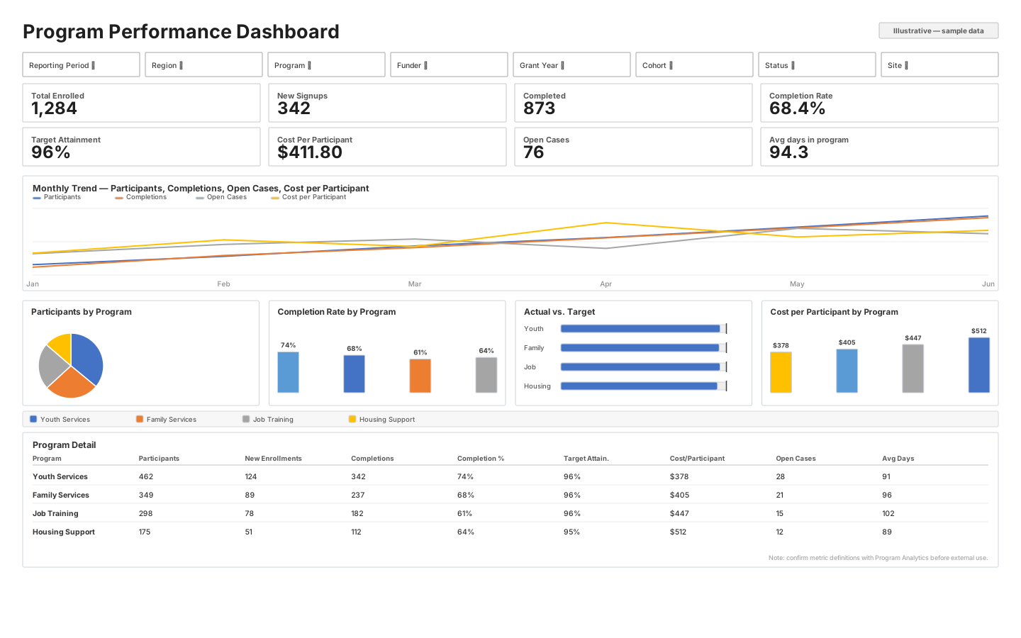
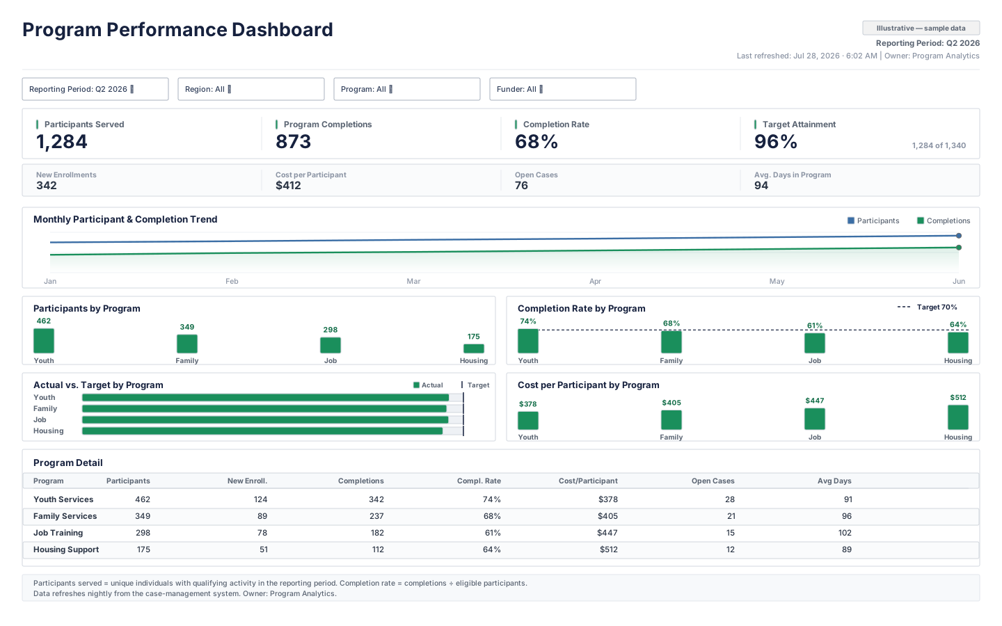
Too many filters and equal-weight KPIs make the dashboard difficult to scan.
Filters are limited to the controls used across the main views, and KPIs are grouped into primary and secondary tiers.
Similar measures use inconsistent names, formats, and visual conventions.
Metric names, number formats, program colors, and labels are standardized across the dashboard.
Charts combine unrelated measures or repeat information already shown elsewhere.
Each analytical view answers one clear question, using measures that belong together and removing unnecessary duplication.
Definitions, refresh timing, data ownership, and important operational details are difficult to find.
Definitions, refresh information, ownership, and a focused detail table are placed where users can find and validate them.
Dashboard Rescue focuses on the report, its calculations, its data source, and the way people use it.
If the real problem is a recurring manual reporting workflow, Reporting Automation may be the better fit.
Instead of one very wide range, these packages separate a targeted rescue from a deeper rebuild with clearer included hours.
Clear answers for teams deciding whether this is the right kind of BI help.
Dashboard rescue is a focused cleanup of a dashboard or BI report that is confusing, slow, hard to maintain, or no longer trusted. The goal is to make the report easier to use, easier to explain, and more reliable.
Yes. Borrowed BI can review an existing Tableau dashboard or BI report, identify what is causing confusion or performance issues, and recommend or make practical improvements.
Dashboards usually lose trust when definitions are unclear, filters behave unexpectedly, numbers do not match other reports, refreshes are manual, or users cannot tell where the data came from.
It depends on the condition of the dashboard. Sometimes a cleanup is enough. Other times, rebuilding the report around clearer metrics, data sources, and user needs is the better long-term option.
It is best for teams that already have an important dashboard but keep hearing questions like ‘Is this right?’, ‘Why does this number not match?’, or ‘Can someone explain how this works?’
A cleaner dashboard is often just the first fix. These related services pick up where Dashboard Rescue leaves off.